Orientation App
During my tenure at the CRA (Canada Revenue Agency), I was entrusted with a pivotal project: the design of an app that would transform the onboarding process for new employees. In response to the increasing prevalence of remote work, the National Live Orientation division sought to craft an immersive online orientation experience.
This project represented a significant step toward adapting to the changing landscape of work, ensuring that remote employees received a comprehensive and interactive orientation that fostered a strong sense of connection and engagement with the CRA.
The concept we developed centred around an app that allowed employees to create personalized avatars and embark on a virtual journey through an expo space. Within this virtual realm, they could explore different booths representing various facets of the CRA. This innovative approach aimed to replicate the in-person orientation experience, providing new employees with an engaging and informative introduction to the organization, even from a remote location.
Our project initially took shape with the concept of a homepage floor, offering users an expansive view of the entire expo layout and the diverse booths available for exploration. However, through a series of revisions and refinements, we transitioned to a more user-friendly design. This new approach transformed the layout into a cluster of islands, each representing a booth. Users could seamlessly swipe between these islands, granting them the ability to explore each booth individually by simply clicking on the island of their choice.
Home Floor

The user experience within our virtual expo was further enriched by offering a choice of islands, each representing a distinct thematic area. Once users made their selection and zoomed in on a particular island of interest, they were seamlessly transported to the corresponding "booths" page. Within the booths page, users discovered a wealth of knowledge organized into subsections. These subsections were artfully divided into tables, each serving as a gateway to deeper insights and information related to the specific subtopics associated with the chosen island.
Booths


The user experience within our virtual expo continued to evolve with a high degree of interactivity and engagement. Upon selecting a table of interest, users were granted the opportunity to interact with a diverse array of objects, NPCs (Non-Player Characters), or elements associated with the chosen subtopic.
Tables and Activities
The table dedicated to the Indigenous Employees Network (IEN) offered a rich and immersive experience for users interested in exploring Indigenous culture and values within the organization. Within this unique table, users encountered a variety of interactive elements:
Medicine Wheel:This interactive element allowed for deeper exploration and understanding of its spiritual and cultural connotations.


Book on the Seven Grandfather Teachings: Users could access an interactive book that served as a captivating guide to the Seven Grandfather Teachings, imparting valuable Indigenous wisdom and insights.


IEN Pamphlet: A swipable pamphlet provided users with an informative overview of the Indigenous Employees Network.


The concept for the HR (Human Resources) island was to have a
VR-themed booth. Avatars would be transported to an expansive virtual landscape where there would be floating interactive boxes, each containing valuable employment information ensuring that employees were not only informed but also engaged in a novel and memorable manner.
The early mockup of the swipeable History screen presents the CRA's history within the "About Us" island. Each outlined image, icon, and section on the screen offers an interactive element, providing users with an immersive learning experience.


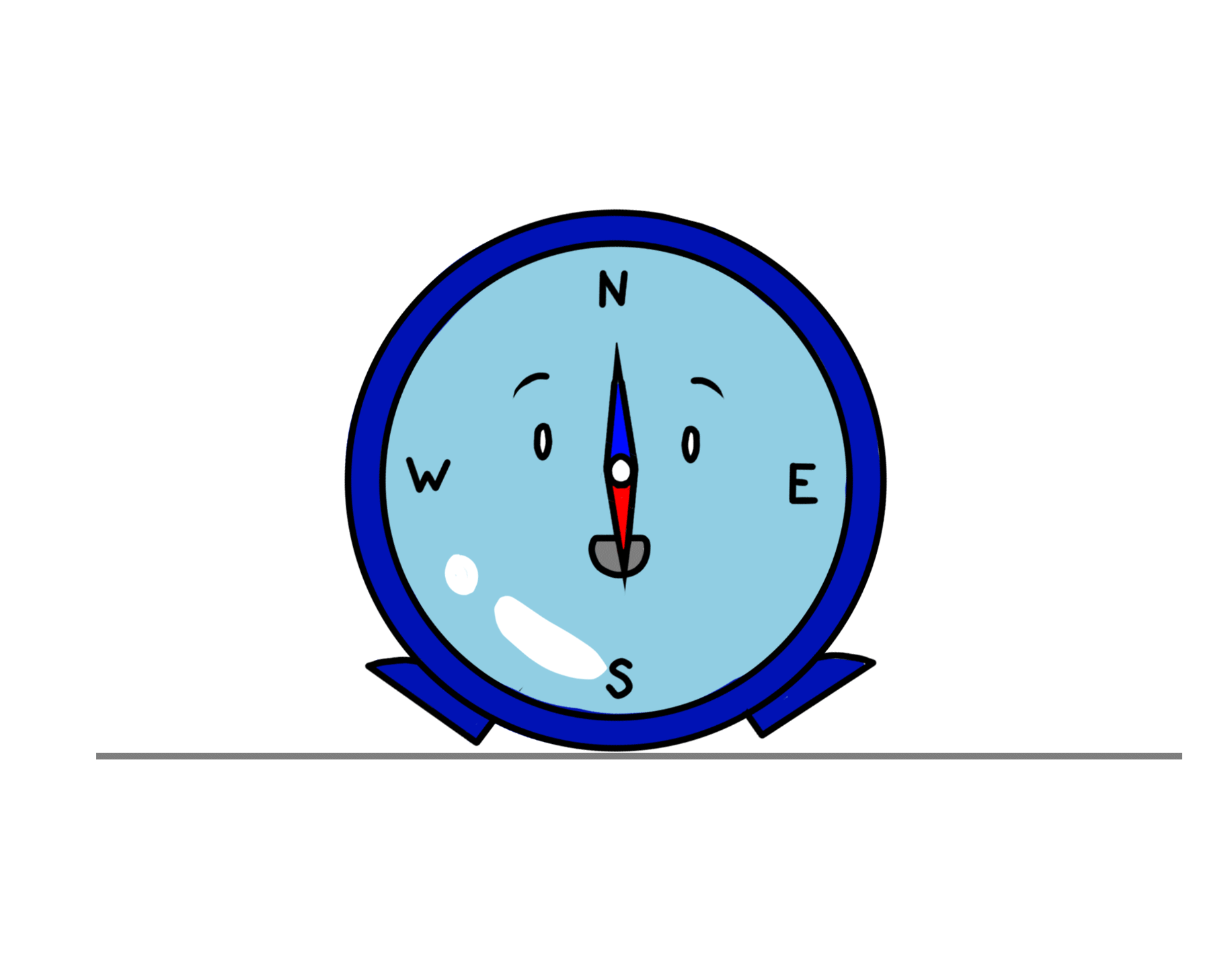
In the context of the orientation app mockups, my design contributions extended to the creation of non-player characters (NPCs), interactive NPCs, and a captivating fictional logo character, personified as a compass. These elements were thoughtfully crafted to enhance user engagement and interaction within the app, offering a dynamic and visually appealing onboarding experience.
Character Designs


These represent the completed iterations of Compi the compass character design, alongside some colour experimentation I conducted.